Battle Deck Energy: Premature Release
A deck-building game inspired by Slay the Spire and M:TG. Build decks over a solo campaign and then use them against your friends in multiplayer!
Download the game for smoother performance and fire shaders!
How to Play:
Click and drag cards with the mouse.
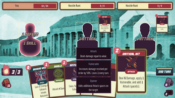
Cards go onto spaces matching their type (ie. Attack, Defend, Skill).
Playing a card spends the Battle Deck Energy cost of that card.
Battle Deck Energy refreshes every round.
If you encounter issues with multi-player:
- Try forwarding the port listed in-game.
- Play it at GOTM.io and use their networked multiplayer support.
Github: https://github.com/Maaack/Battle-Deck-Energy
| Status | In development |
| Platforms | HTML5, Windows, macOS, Linux |
| Rating | Rated 5.0 out of 5 stars (1 total ratings) |
| Author | Maaack |
| Genre | Card Game, Role Playing |
| Made with | Godot |
| Tags | 2D, Deck Building, Godot, Multiplayer, Singleplayer |
| Average session | A few seconds |
Download
Development log
- Update "Lame Deck Precedent" v0.2.0Dec 21, 2020
- Launch of Battle Deck Energy: Premature ReleaseOct 16, 2020


Comments
Log in with itch.io to leave a comment.
I intended to play for a minute or two and ended up sinking over an hour into it until I died at Cafeteria. It'd only taken a few rounds to get sucked into the loop and I definitely enjoyed it!
I saw from the comments that UI/UX is a high priority and I agree, the game could benefit from a graphical overhaul - possibly a tutorial or how-to-play screen as well - but as far as gameplay goes I don't think much improvement is needed at all! The cards have decent variety and synergy and the rules allow for strategic planning and accidental shooting oneself in the foot which I definitely didn't keep doing in spite of myself. I thought the number of stats (defence, en garde, venomous etc.) was going to get overwhelming but it wasn't too bad once I got used to it. Maybe drip-feeding the mechanics a little slower in the first few rounds could ease the transition into more complex card effects more.
I liked the preview of what the enemy's next card is going to be, but I was unsure of how enemy turns worked. Do they play their one card and end their turn? There was a lot of text flying around that I wasn't entirely sure what set off at any moment. I rolled with the punches and it didn't detract from my experience but some clarification - or a smarter player - probably would have allowed for better strategy. In any case, card effects and their sources being shown clearer would go a long way.
As far as progression - a word I'm seeing myself say a lot in these next paragraphs - the game just being battle after battle endlessly isn't necessarily a bad thing when it's a good time, though some form of showing progress aside from the gradually increasing strength of opponents may be nice. The concept of advancing towards a place/enemy like the Cafeteria was cool once it happened, maybe bringing small/snappy scenes like that between rounds right from the start?
It feels like the kind of game that would - and already kind of has - lent itself to a, for want of a better word, 'incidental' storyline, sort of like Binding of Isaac in that a premise is set up but there isn't really a 'story', except in the way that it gives a context to the player's goals without affecting gameplay. The 'plot' isn't really interacted with at all until something like a boss fight or even the final battle, and I feel like the pseudoplot of taking down bullies could be applied in this way pretty nicely with this sort of game. The advancement of basement levels is also an example of suggesting progression to a player without actually meaning anything - the dungeon is just being re-generated, but to the player it's a new location they've made it to.
I'm certainly looking forward to any future updates!
Thank you for leaving feedback! I hope to have time to incorporate yours and other user feedback into future releases. Very good point about using visual cues to indicate progress.
I like the overall game loop. The game moves fast enough that I could see myself sneaking in a quick session or two on my phone/Switch when I have a few minutes.
I thought that the attack/skill/defend text could have stood out more. It took me a few minutes to understand why I couldn't attack the same target multiple times, why I couldn't put down two shields on myself, etc. Maybe a quick animation of the words getting crossed out when an applicable card is set down would help?
Thanks for the feedback! Improving the battle UI/UX is at the top of my list. I like the idea of animating crossing out the text, too.
Hi :) I really like how fast the game works in my browser! I'd love to see a bit more of clarification about targets I should attack in this game. When I have a number of characters on the screen I'm not sure who is the main target for me. In Slay the Spire they solve this problem just by splitting screen into left and right zones. Best of luck with making the game, I think there are a lot of people who will be happy to play more games with Slay the Spire vibes :)
Thanks for the feedback! I'm glad to hear it's running well in your browser, as I was not getting as good of performance. You are also right on with the target audience; Slay the Spire was my biggest motivation for making this game.
There will definitely be a UI redesign of the battle scene, as it's not intuitive, even for those familiar with the genre. The card 'spaces' add another layer that needs to be communicated to the player, and I'll keep experimenting with how to do that. I hope you still experienced a few moments of fun.
I appreciate you taking the time to look at another deck-builder while working on one. Thanks again, and good luck on your game, too!
Feel free to leave any feedback. If you like deck-builders, here are some similar games I'm following on itch.io:
https://ludenio.itch.io/flip-a-talk
https://aeternuxolus.itch.io/knights-path
https://littleleogames.itch.io/clearings